Acquink — Brand Identity + Website Redesign
Brand Identity · Website Redesign · B2B SaaS
Business Problem
A decade-old name, Enixta, no longer signalled what the company had become: an AI engine reading millions of customer voices.
The old identity read like legacy enterprise software — no cue of AI, ML, or emotion-aware intelligence.
The landing page looked like every other analytics tool: dense, generic, undifferentiated in a crowded category.
Enterprise buyers (Flipkart, Samsung, Mars Petcare tier) needed to trust the brand within seconds of landing.
Two problems, one project: conceptualise a new mark and rebuild the site around it.
Design Impact
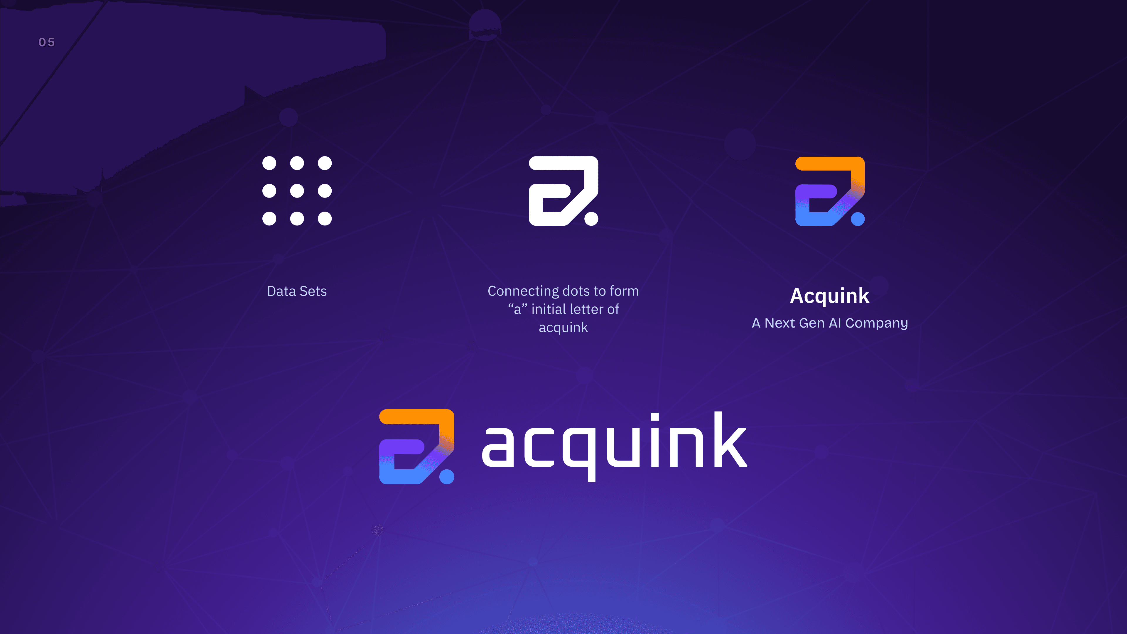
A name with a thesis. Acquink = Acquire + Think, the product's actual job, said in one word.
A logo built from data. The letterform "a" is drawn from connected dots, each dot a data point, the connection the intelligence. AI made visible without a single circuit-board cliché.
A palette with intent. Orange for approachability, Blue for trust, Electric purple for creative and modern warmth on top of a category that defaults to cold blue.
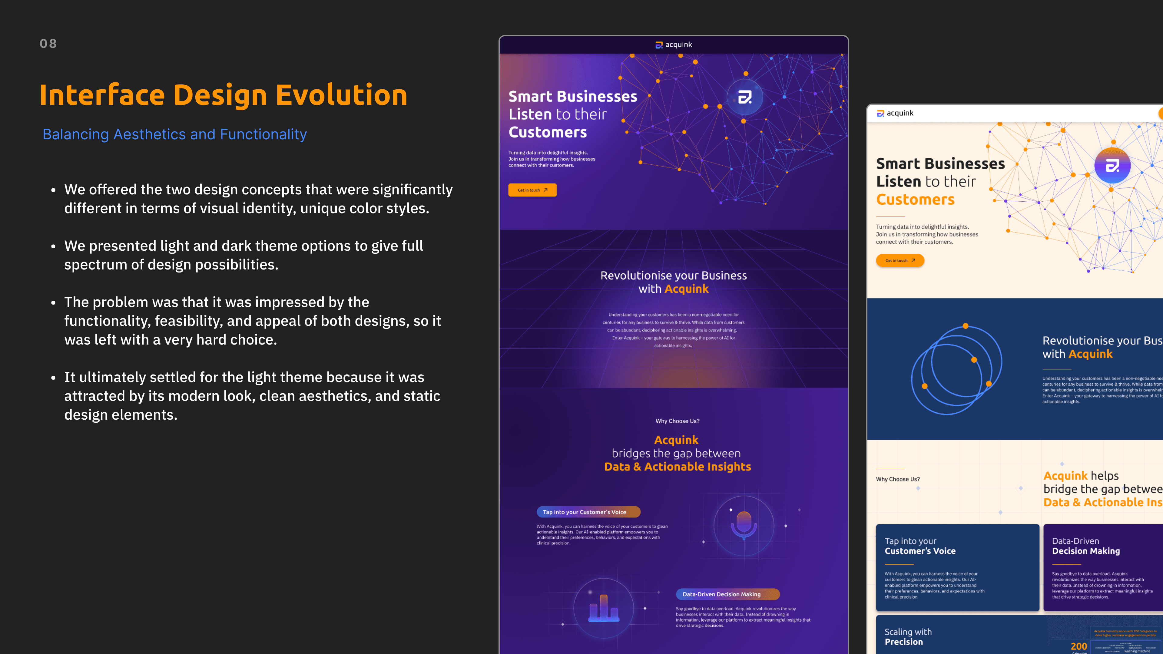
Two directions, one decision. Light and dark concepts presented end-to-end; the client chose light for openness and legibility.
A page that sells the engine, not the features. Simplified layout, clear hierarchy, and a narrative that moves from problem → engine → proof.
A system, not a screenshot. Type scale, colour roles, and components documented so the brand held up as the product line expanded.
Where it went. The identity now fronts a platform reporting 4x engagement uplift and up to 30% conversion improvement at India's top e-commerce platform — and carries recognitions including RAISE 2020 (Govt. of India) and IAMAI's Best Tech for eCommerce.




Other Projects